Legal Term Interface

The core goal of this project was to redesign and integrate a significantly updated and expanded privacy policy and create a new protection of personal information webpage. My solution focused on restructuring dense, complex information into a clear, accessible hierarchy to maintain readability and enhance the user experience.

Service

UI/UX Designer & Integrator

Duration

6 days

Client

exo (Réseau de Transport Métropolitain)

The Problem

The Problem

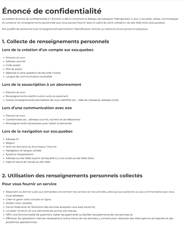
The challenge was not that the original confidentiality terms were difficult to read, but rather that a major content update introduced a large volume of new information, making the consolidated document difficult to organize and navigate at first sight. Specifically, the updated privacy policy needed to accommodate three major policy categories, which compromised the page's structure and scannability.

Figma - Prototype of the original Privacy Policy webpage.

Goals

Goals

The main goals of this project were to:

  • Accommodate New Content: Successfully integrate a significantly larger volume of updated privacy policy text.

  • Enhance Structure Readability: Redesign the page layout to make the complex information easy to read and the page's structure clear.

  • Improve Information Architecture: Clearly differentiate between the main policy categories and their numerous sub-sections.

My Process

My Process

My process involved iterative design, with a strong focus on optimizing the information architecture for user clarity.

Content Analysis

I thoroughly reviewed the provided Word documents, which outlined the text for the three main policy categories: Privacy Policy, "exo on demand" privacy statement, and "exo all ears" privacy statement.

Initial Prototype

I created a first Figma prototype that uses three main accordions for the three categories. The goal was to optimize page length.

Figma - Prototype of the first version of the Privacy Policy webpage.

Stakeholder Feedback & Conflict

The project team found the information architecture unclear, as the many subsections within each long accordion were hard to differentiate. The team suggested putting accordions inside accordions—a pattern I successfully argued against due to known accessibility and usability issues.

Revised Prototype

I separated the three policy categories into distinct, labeled sections (using headers) on the page. I then implemented accordions only for the subsections within each category. This visually clarified the main structure while optimizing space for detailed content.

New Page Creation

The revised solution was directly applied to the new, simpler Protection of Personal Information webpage, which was approved immediately due its clear structure.

Figma - Prototype of the new Protection of Personal Information webpage.

The Solution

The Solution

The final design provided a clear and accessible solution for navigating complex legal texts:

  • Clear Sectioning: The three major policy categories were broken out into their own distinct sections, clearly labeled with prominent headers. This immediately established the main information hierarchy.

  • Optimized Space: Accordions were used only for the subsections of information within each main category. This ensured that the page remained short, but the user is not forced to expand a single, massive accordion to find what they needed.

  • Improved Scannability: By separating the main topics, users can quickly and visually identify the categories (e.g., "exo on demand") before clicking to reveal the specific details.

Screenshots of the final Privacy Policy and Protection of Personal Information webpages.

Learnings

Learnings

I learned that information architecture is critical for heavy-content pages. When dealing with a large volume of legal or technical text, the risk of a user getting lost is extremely high. In addition to creating a logical structure, it is equally important to use the correct design patterns (like sections vs. nested accordions) to visually reinforce the structure and enhance the content's readability and usability.

Let's create experiences that matter.

Whether you have a specific role in mind or just want to talk about design, code, or climbing—I'd love to hear from you.

Cynthia © all rights reserved

Made in Framer

Let's create experiences that matter.

Whether you have a specific role in mind or just want to talk about design, code, or climbing—I'd love to hear from you.

Cynthia © all rights reserved

Made in Framer